

Hello Divi enthusiasts, Ken from Divi Supreme!
Dark mode used to be a nice-to-have. Now visitors expect it. They flip their phone, their OS, and half their favourite apps to dark, then land on a site that blasts them with white at midnight. Adding a proper light/dark toggle to a Divi site has always meant wrestling with custom CSS, a pile of colour variables, and the nagging worry that one section will look wrong. Not any more.
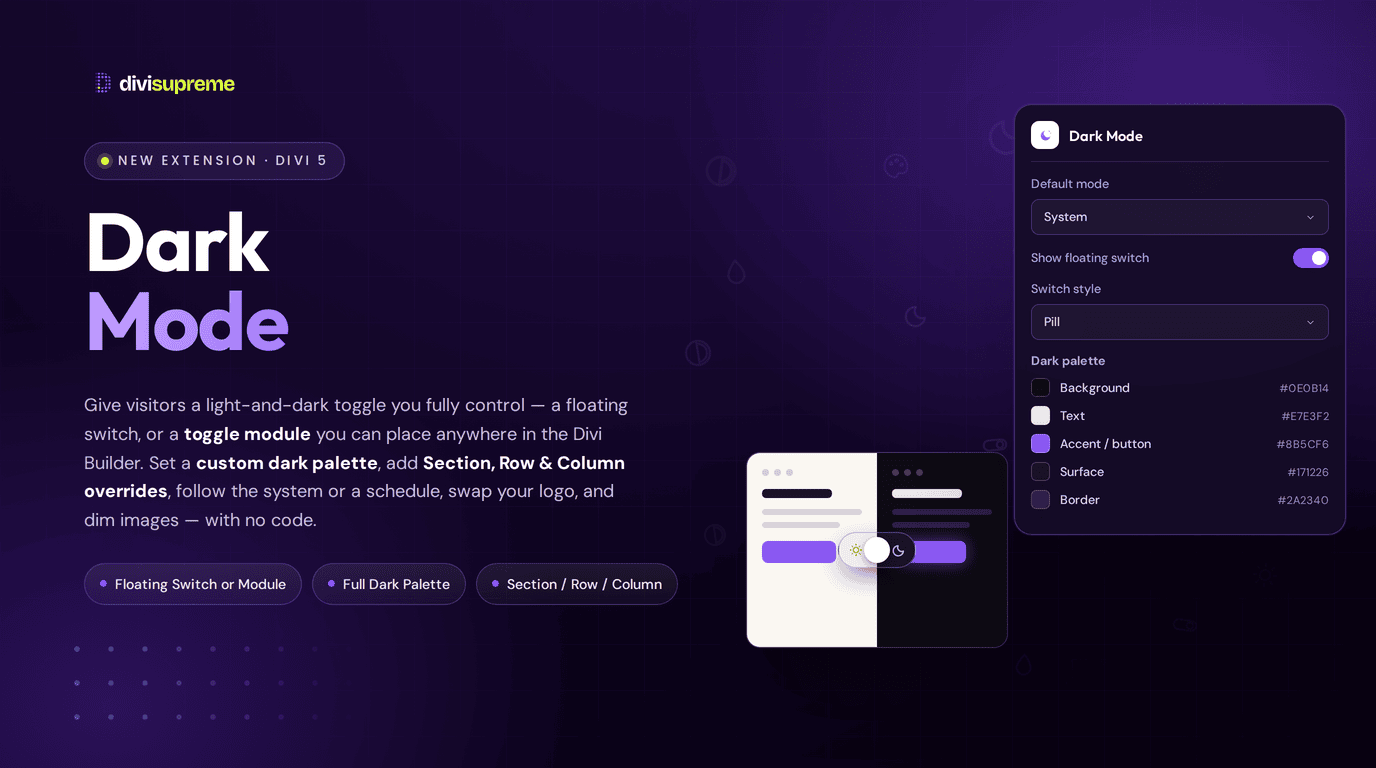
Our new Dark Mode extension gives your visitors a toggle you fully control: a floating switch or a placeable module, a dark palette you define yourself, and the ability to override any section, row, or column when dark mode is on. All without touching a line of code. Now available in Divi Supreme Pro 5.0.52.
What Is Dark Mode?
In plain terms: Dark Mode lets visitors switch your site between light and dark colour schemes, and it hands you the controls for how that looks and where it loads. It respects the visitor’s device preference by default, remembers their choice, and (importantly) never changes your carefully built light-mode design. It simply layers a dark scheme on top when someone asks for it.
There are two ways to give people the toggle, and you can use either or both:
- Floating switch: a fixed button that sits on the page, styled entirely in the Dark Mode customiser. Perfect for a site-wide control.
- Dark Mode Toggle module: a placeable module you drop into headers, footers, or any layout. Use this in the Theme Builder when you want the toggle inside the design rather than floating over it.
On top of that, you set a custom dark palette: background, text, headings, links, buttons, borders and more, and you can override Section, Row, and Column backgrounds (and their text, heading, link, and border colours) individually when dark mode is on. It’s the flexibility of hand-coded dark mode without any of the hand-coding.
Two Ways to Toggle: Floating Switch or Module
Most sites just want a control that’s always there, and that’s the floating switch. Turn it on, pick a corner (bottom right, bottom left, top right, or top left), and set the offset. It respects safe-area insets, so notches never clip it. You choose the style and what it shows:
- Switch style: Pill, Icon, or Switch (a classic track-and-thumb toggle).
- Content mode: the built-in sun / moon, your own custom icons, text labels, icon + text, or even custom images for light and dark.
- Stacking and hover lift: control how high the switch sits above your content, with an optional subtle lift on hover.
When you’d rather the toggle live inside your design (say, next to the menu in a Theme Builder header), reach for the Dark Mode Toggle module instead. It carries the same switch styles and content modes, and it can inherit the floating switch’s look with a single option (Apply floating switch design to Dark Mode Toggle module), so both controls match without you styling twice.

Set Your Own Dark Palette
This is where Dark Mode earns its keep. Instead of a generic “invert everything” filter that makes photos look strange and washes out your brand, you define the dark scheme yourself in the Design tab. These colours apply site-wide whenever dark mode is active:
- Background, Text, and Heading: the foundation of the dark scheme.
- Link and Link hover: hover doubles as the keyboard focus colour, so accessibility comes along for free.
- Accent / button and Button text: keep your primary buttons on-brand in the dark.
- Surface and Border: for elevated panels and cards.
- Input background, text, and border: leave any of these empty to inherit Surface, Text, or Border automatically.
A quick tip: use Divi’s global colours in your layouts and the remapping stays clean and consistent across the whole site. And because you can preview the dark palette right on the builder canvas while you work, there’s no guess-and-refresh.

Decide Exactly How Much Goes Dark
Here’s where most dark-mode plugins get greedy: they repaint every card, panel and box on the page, and a layout you spent hours perfecting suddenly looks muddy. Dark Mode hands you a dial for precisely this, Apply Surface to, so you choose how far the dark Surface colour reaches across your modules:
- Existing backgrounds (the default): only remaps the backgrounds you’ve actually painted, plus blog and post-carousel cards. Everything else is left exactly as you designed it.
- Content cards: also lifts common cards onto the dark surface (Blurb, CTA, Testimonial, Pricing, Accordion, Team and Divi Supreme Card), so unpainted boxes still look intentional in the dark.
- All content modules: paints every content module for a uniform dark look, while leaving images, buttons and menus alone.
- Don’t apply to any: switches automatic surfacing off entirely. Your page background, text, link colours and any Overrides still apply, and the
.dsm-dm-surfaceutility is there if you’d rather darken just a few elements by hand.
Transparent modules stay transparent whichever mode you pick, and your Section, Row and Column overrides always win. It’s the difference between dark mode you fight with and dark mode that does exactly what you tell it.

Smart Defaults: System, Schedule, and Memory
Dark Mode is thoughtful about when it shows dark, so visitors get the right scheme without lifting a finger:
- Default mode: choose System (follows the visitor’s device via
prefers-color-scheme), Light, or Dark for anyone who hasn’t picked yet. - Auto dark by time: set a start and end time and the site goes dark in that window, unless the visitor has already chosen for themselves.
- Remembered choice: the moment a visitor toggles, their preference is stored in the browser and wins until they reset it.
You also decide where dark mode loads with Display on: the entire site, specific pages only, everywhere except a chosen list, or per page (flip it on individually with Enable on this page). It’s as broad or as surgical as you need.

The Thoughtful Details
The small touches are what make dark mode feel considered rather than bolted on:
- Swap logo in dark mode: supply a light and a dark logo and matching images swap automatically when the scheme changes, so your logo never disappears against a dark header.
- Dim images in dark mode: gently lower image brightness so photos don’t glare at night. Logo-swap images are skipped so they stay crisp.
- Reset saved preference: let visitors clear their stored choice with a long-press, a double-click, or both, returning to your default mode.
- Keyboard shortcut: enable a toggle shortcut such as
Alt + DorCtrl + Alt + Dfor power users. - Scheme-change events: for developers, Dark Mode can emit a custom event when the scheme changes, so you can hook in your own logic. No third-party analytics SDK is loaded.
Override Any Section, Row, or Column
Sometimes the global palette is almost right, but one section needs its own treatment in the dark: a hero that should stay deep navy, a call-out band that needs a different background. That’s what Dark Mode Overrides are for.
Select a Section, Row, or Column, click the moon on the Design → Background label (or open Advanced → Dark Mode Overrides directly), and set a dark background, text, heading, link, or border colour for that block alone. Your light-mode design stays exactly as it was. Leave any colour empty and it simply inherits the global dark palette.
This is especially handy for Theme Builder headers: set a section override for the dark background, and nested Menu module backgrounds are cleared automatically so your override shows through cleanly. Pair it with logo swap and your header looks intentional in both schemes.

Real Use Cases: Where This Shines
- Brand-safe dark mode. Define a dark palette that keeps your accent colour and buttons on-brand, instead of a jarring auto-invert.
- Theme Builder headers. Drop the Toggle module beside your menu, override the header section for a dark background, and swap in a light logo. It works the same way inside a Supreme Mega Menu header.
- Reader-friendly content sites. Default to System so visitors reading at night get dark automatically, and dim images so photos are easy on the eyes.
- Scheduled dark evenings. Use Auto dark by time so the site shifts to dark after hours without the visitor doing anything.
- Accessibility-minded builds. Give people a real choice of scheme, with keyboard shortcuts and focus-colour support built in. Add a tooltip on the switch itself if the icon alone is not obvious.
How to Enable It
- In your WordPress dashboard, go to Divi Supreme and open the Extensions list. Switch on Dark Mode Toggle and save. (Until it’s on, the Dark button, customiser, floating switch, and module won’t run.)
- In the Visual Builder, click Dark on the builder bar to open the Dark Mode customiser. Set your default mode and where it loads under Settings, build your palette under Design, and add any dark-only tweaks under Advanced.
- Turn on the floating switch for a site-wide control, or add the Supreme Dark Mode Toggle module wherever you want the toggle to live in the layout.
The docs cover every option in detail: the Dark Mode Toggle extension and the Dark Mode Toggle module.

Why It’s Worth Using
A good dark mode says a site is looked after. It meets visitors where they already are, on devices set to dark, and it does it without you maintaining a second stylesheet or praying nothing breaks after a Divi update. You keep full control of the palette, you decide where and when it loads, and you can fine-tune any awkward section without unpicking your light design. It’s the premium, considered version of a feature people increasingly expect, and it’s already included in Divi Supreme Pro.
Ready to Try It?
Update to the latest Divi Supreme Pro, switch on Dark Mode Toggle under Extensions, and give your visitors a light-and-dark experience that’s genuinely yours.
These are just a few of the many improvements. Your feedback is making Divi Supreme Pro for Divi 5 stronger every day. If you spot something, report it here!
Stay tuned for more updates, and please don’t hesitate to reach out if you have any questions or need assistance with anything related to Divi Supreme or Divi 5.
Best Regards,
Ken and the Divi Supreme Team
0 Comments