Hello Divi enthusiasts, Ken from Divi Supreme!
Tooltips are one of those small things that quietly make a page better. A short hint next to a pricing feature, a label on an icon, a note explaining what a field actually wants. They keep the layout clean and put the explanation exactly where the question happens.
The trouble has never been the idea. It has been the plumbing. Adding a tooltip in Divi has usually meant restructuring part of your layout, or dropping into custom code, just to show one line of text on hover.
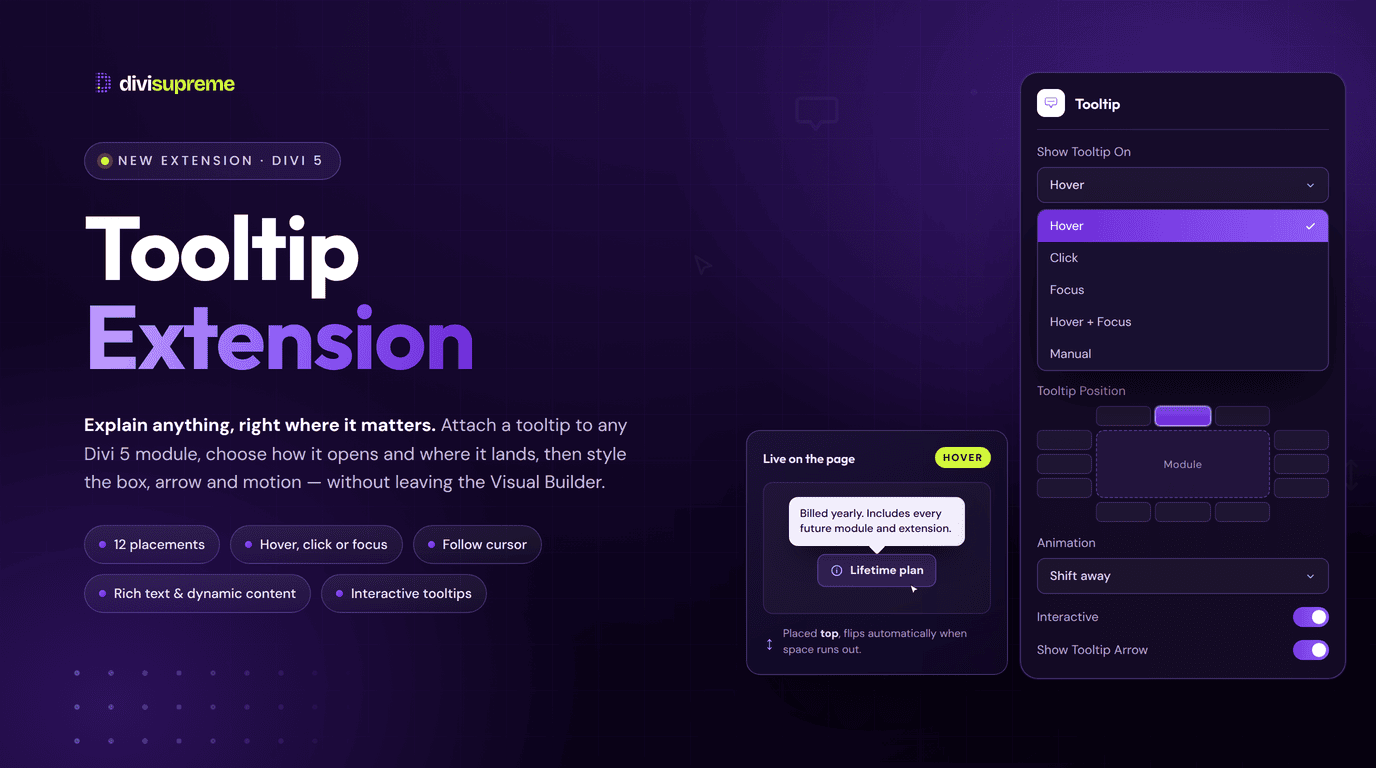
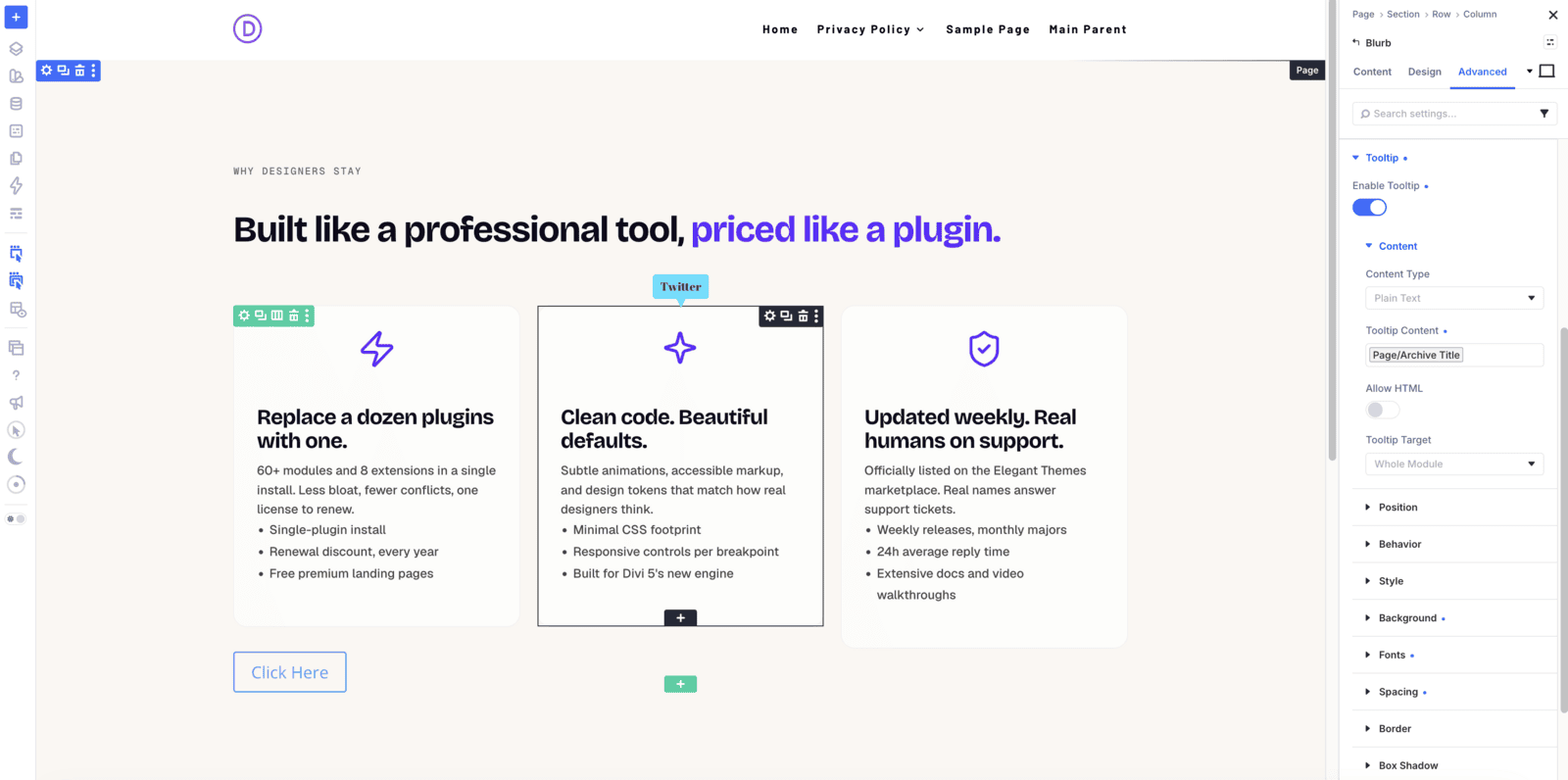
Our new Tooltip Extension takes a different route. Switch it on, open any Divi 5 module, and you will find a Tooltip group waiting in the Advanced tab. Flip one toggle, type your text, and that module has a tooltip. Nothing gets nested, nothing gets rebuilt, and your layout tree stays exactly as you designed it. Now available in Divi Supreme Pro 5.0.59.
What Is the Tooltip Extension?
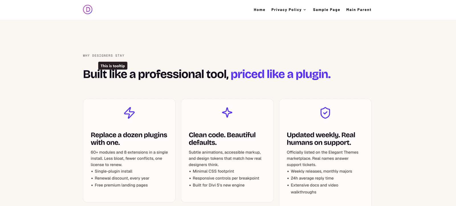
The Tooltip Extension adds a full tooltip engine to every module in Divi 5, both Divi’s own modules and every Divi Supreme module. It is built on Tippy.js, the same library behind the tooltips you have seen on GitHub, Stripe, and most well-built app interfaces, so the behaviour feels familiar straight away.
The important part is where it lives. It is not a module you place. It is an option group that appears inside modules you already have, sitting in the Advanced tab right above Visibility. Turn on Enable Tooltip, and the rest of the controls unfold beneath it: content, target, trigger, position, timing, and a full set of Divi design groups for styling the tooltip box itself.
Why We Built It
Fair credit where it is due: Divi 5 ships its own Tooltip module, and for straightforward jobs it works well. So why build this at all? Because of how it is structured.
Divi’s Tooltip module is a nestable container. You add it inside the element you want to describe, and that parent element becomes the anchor. That design carries two consequences you feel quickly on a real build:
- Every tooltip is another module. Twelve tooltips on a pricing page means twelve extra modules in your layout tree. You are restructuring the page to add a hint, and any element that cannot take a child module cannot take a tooltip at all.
- It anchors to the whole container, not a part of it. You cannot attach it to just the link inside a text block, or just the button inside a card. Elegant Themes confirmed this themselves in the comments on their own tooltip article: it can only be used inside an entire module or container, not a specific part of one, and their suggested workaround is to switch the text editor to Code and hand-write an HTML
titleattribute.
That last one is the moment most builders give up and reach for custom code, which is exactly the moment we like to remove. So we approached it from the other end. Instead of a tooltip you place, we built a tooltip you switch on, with a Tooltip Target setting that accepts a CSS selector so you can point it at one specific thing inside the module: the link, the button, the icon.
Real Use Cases: Where This Shines
- Pricing table clarifiers. Explain what “unlimited sites” or “fair use” actually means, without turning every row into a paragraph or making the table taller.
- Icon labels. Give a row of feature icons proper names on hover, so a clean icon strip stays clean and still makes sense. Works nicely over anything from the Icon Libraries.
- Form field hints. Tell people what format a field wants at the moment they are filling it in, using Focus as the trigger so keyboard users get the hint too.
- Button context. Target just the button inside a card with a custom selector, and explain what happens after the click before anyone commits to it.
- A hint that is too long for a tooltip. When one sentence will not do it, hand the job to Page Tour and walk the visitor through the whole page instead.
- Rich mini cards. Turn on Interactive, put a link inside the tooltip, and let visitors move their pointer onto it without the whole thing vanishing.
- Dynamic content in loops. Set the tooltip content to Dynamic Content and let each item in a loop carry its own hint, designed once.
Every Setting, Explained
Content: plain text, rich text, or dynamic
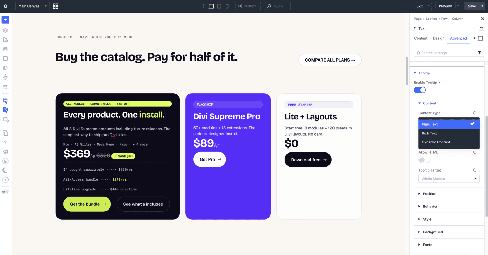
Content Type gives you three ways to fill a tooltip. Plain Text for a simple hint. Rich Text when you want formatting, with Allow HTML to render it properly. Dynamic Content when the text should come from the post, product, or custom field, which is what makes tooltips genuinely useful inside a loop.
The content field is responsive, so you can write a shorter hint for phones and a fuller one for desktop.
Target: the whole module, or one element inside it
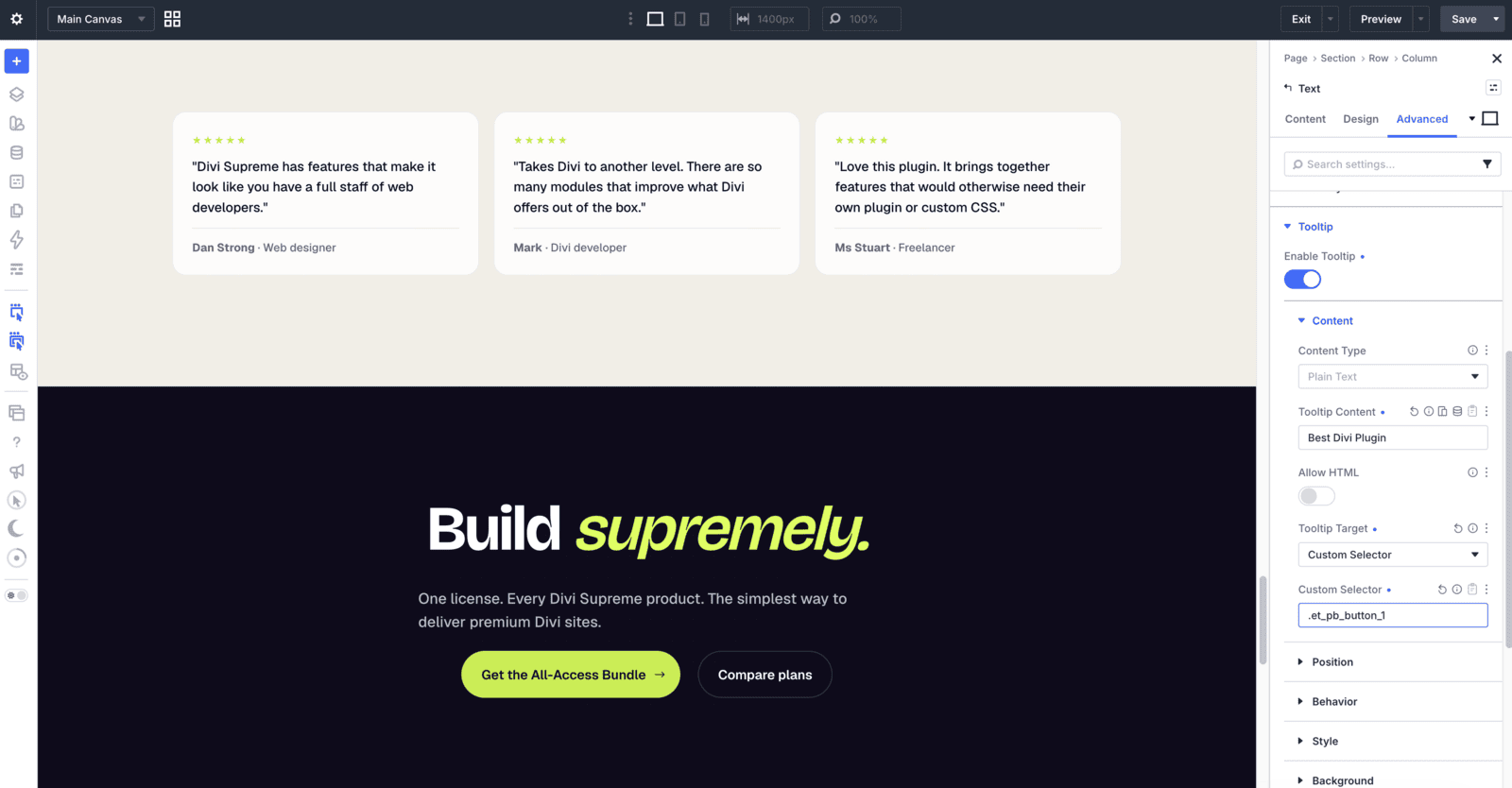
This is the setting that unlocks the rest. Tooltip Target has two modes:
- Whole Module: the tooltip attaches to the module itself. This is the quick default and covers most cases.
- Custom Selector: you give it a CSS selector relative to that module, such as
aor.et_pb_button, and the tooltip attaches to that instead.
So a tooltip on the link inside a text module, or on the button inside a card, becomes a one-line setting rather than a code module.
Trigger and movement
Show Tooltip On decides what opens it: Hover, Click, Focus, Hover + Focus, or Manual. Hover + Focus is the one worth reaching for by default, because it covers pointer users and keyboard users in a single choice.
Tooltip Movement decides how it behaves once open: Anchored keeps it pinned beside the target, Follow Cursor lets it track the pointer, Follow Horizontal and Follow Vertical track on one axis only, and Initial places it where the pointer entered and leaves it there. Anchored suits explanations. Cursor-following suits diagrams and image maps.
Position, skid, and distance
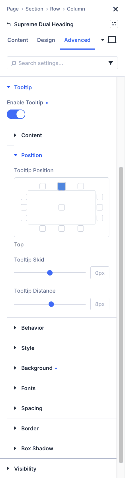
Tooltip Position is a visual picker with thirteen cells arranged around the target, so you click where you want it rather than remembering placement names. You get all four edges plus start and end alignment on each, and a centre cell for Auto.
Whichever you choose, the tooltip flips to a sensible fallback when it would otherwise be clipped by the edge of the viewport, so a tooltip near the bottom of the screen quietly moves above the target instead of disappearing off the page.
Tooltip Skid shifts it along that edge, and Tooltip Distance sets the gap from the target, defaulting to a tidy 8px.
Timing, interactive, and sticky
Tooltip Open Delay and Tooltip Close Delay stop tooltips flickering on every accidental pass of the cursor. A short open delay makes a busy page feel calm rather than twitchy.
Interactive is the setting to know if your tooltip contains anything clickable. It lets the pointer travel from the target onto the tooltip without closing it, and Interactive Border adds a forgiving hit area around it so the journey does not need a steady hand. Sticky keeps it visible while moving between the two, and Hide On Click controls whether clicking the target dismisses it.
Animation and appearance
Choose from Fade, Scale, Shift away, Shift toward, Perspective, or None, then set the Animation Duration in milliseconds. Turn on Show Tooltip Arrow for a pointer back to the target, with its own Arrow Size and Arrow Color. Leave the colour empty and it follows a solid tooltip background automatically, so the arrow always looks attached.
Style it with Divi’s own design groups
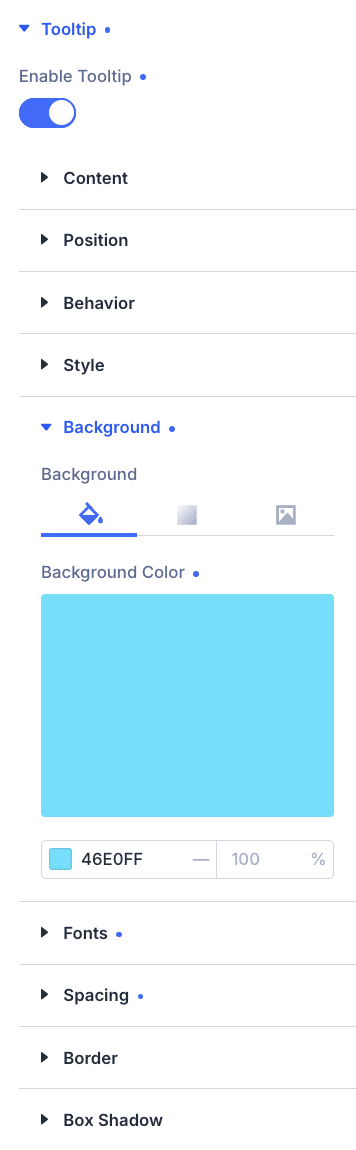
The tooltip box is not a fixed black rectangle you nudge with custom CSS. It gets the native Divi groups you already know: Background (including gradients and images), Font, Spacing, Border, and Box Shadow. Global colours and fonts work as expected, so tooltips match the rest of your design system instead of standing apart from it.
The thoughtful details
- Append To. Keep the tooltip inside the module with Parent, or choose Body to portal it out. Body is the fix for the classic problem of a tooltip getting clipped inside a card with
overflow: hidden. - Touch Behavior. Set tooltips to Enabled, Disabled, or Hold on touch devices, so a hover hint does not become a tap trap on a phone.
- Max Width and Z-Index. Cap how wide a tooltip grows, and control where it sits in the stack when a sticky header or overlay is in play.
- Tooltip CSS Class. Add your own class to the tooltip element when you want to hook into it.
- Responsive throughout. The behaviour settings respect Divi’s breakpoints, so a tooltip can behave one way on desktop and another on mobile.
- Light by default. The tooltip scripts and styles only load when at least one tooltip is actually enabled on the page. A page with no tooltips loads nothing extra, and the settings ride along on the module wrapper rather than injecting inline scripts.
How to Enable It
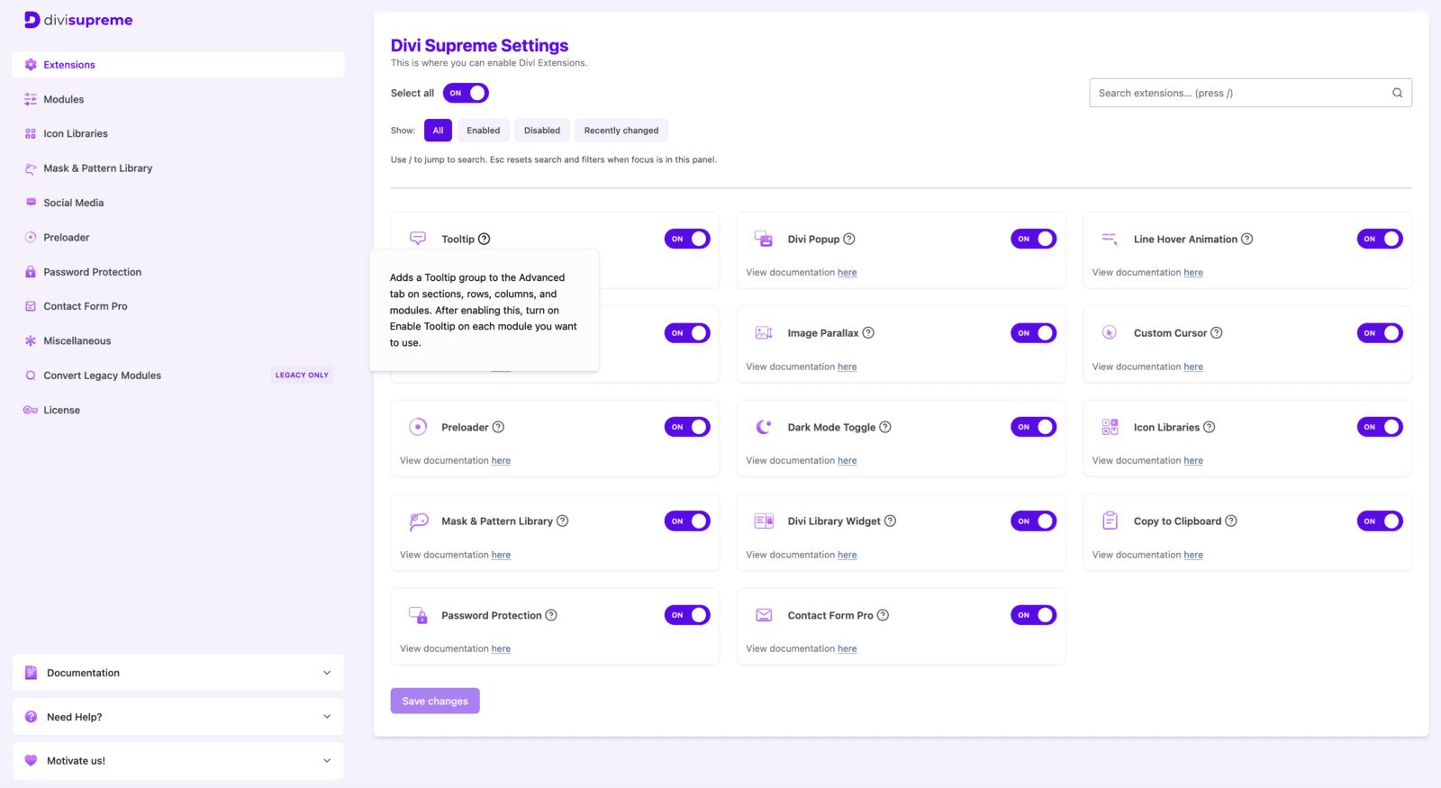
- In your WordPress dashboard, go to Divi Supreme Pro → Extensions and switch on Tooltip. It is off by default, so nothing loads until you ask for it.
- Open any page in the Visual Builder and select the module you want to explain.
- Go to the Advanced tab, open the Tooltip group, and turn on Enable Tooltip.
- Type your Tooltip Content, then set the target, trigger, and position. Style the box in the design groups below if you want it to match your brand.
Every option is documented in full: Tooltip extension.
Why It’s Worth Using
The best thing about this one is what you do not have to do. You do not restructure a layout to add a hint. You do not open a code module to attach a tooltip to a single link. You do not maintain a snippet of custom CSS across a dozen client sites just to keep tooltips looking consistent.
You select a module, flip a toggle in the Advanced tab, and type. Then, when a design calls for something more precise, the depth is already there: point it at one element with a selector, let it follow the cursor, make it interactive, portal it out of an overflow-hidden card, or hold it back on touch devices. Small details, handled properly, are what make a site feel considered.
Ready to Try It?
Update to the latest Divi Supreme Pro, switch on the Tooltip extension under Extensions, and give any module on your site the context it has been missing.
These are just a few of the many improvements. Your feedback is making Divi Supreme Pro for Divi 5 stronger every day. If you spot something, report it here!
Stay tuned for more updates, and please don’t hesitate to reach out if you have any questions or need assistance with anything related to Divi Supreme or Divi 5.
Best Regards,
Ken and the Divi Supreme Team