

Hello Divi enthusiasts, Ken from Divi Supreme!
You have built the page. Everything a visitor needs is on it. And yet the first time somebody lands there, they pause. Where do I start? What does this bit do? Is that the button I am meant to press?
It happens most on the pages you worked hardest on: a member dashboard, a booking flow, a pricing page with a comparison table, a new feature you have just shipped. The design is fine. The problem is that a first-time visitor has no idea which part matters first.
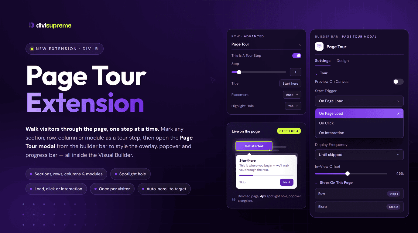
Our new Page Tour Extension solves that the way a good colleague would. It dims the page, spotlights one element at a time, and puts a short explanation right next to it. Next, next, done. You build the whole thing inside the Divi Builder, and the step you are creating is simply the module you already have open. Now available in Divi Supreme Pro 5.0.60.
What Is the Page Tour Extension?
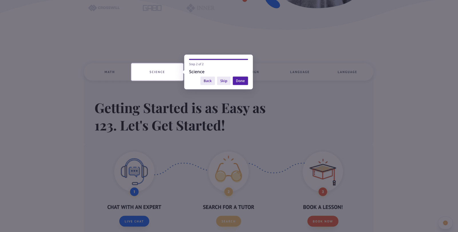
A page tour is a guided walkthrough that plays on top of your live page. The rest of the page dims, one element stays lit, and a small popover explains it. The visitor clicks Next to move along, Back to go again, or Skip to get on with their day. A progress bar shows how far through they are.
What makes this version different is where you build it. There is no separate tour builder and no list of CSS selectors to keep in sync. Open any section, row, column, or module, go to the Advanced tab, and you will find a Page Tour group. Switch on This is a tour step, give it a number, write the title and body copy, and that module is now part of the tour.
The tour-wide settings, the trigger, the overlay, the popover design and the buttons, live in their own customiser on the Divi Builder bar. Your steps live on your modules. Nothing else is added to your layout.
Your Steps Live on Your Modules
Most walkthrough tools ask you to describe the thing you want to highlight. You hand over a CSS selector, or pick an element from a list, and the tour holds onto that description. It works beautifully right up until the page changes. Rename a class, move a row, duplicate a section, and the tour is quietly pointing at the wrong element, or at nothing at all.
Page Tour skips that problem entirely, because a step is not a separate thing that refers to a module. It is a setting on the module. You are not describing the element to the tour. You are standing on it.
That has some genuinely useful consequences. Move the module and its step travels with it. Duplicate it and you have a duplicated step ready to renumber. Delete it and the step goes too, with no orphaned reference left behind to break the run. And because a step is just an attribute, nothing extra is added to your layout: the Layers panel stays exactly as clean as you built it.
It is the same approach we took with the Tooltip Extension, and for the same reason. Some features are not layout blocks. They are behaviour you want to attach to layout you already have.
Real Use Cases: Where This Shines
- Member dashboards and client portals. Walk a new member through the four things they actually need on their first login, instead of writing a help doc nobody opens.
- Feature launches. Shipped something new on an existing page? Run a short tour once per visitor so returning users notice it, then never see it again.
- Complex booking or quote forms. Explain the awkward field, the one that generates all your support emails, at the exact moment the visitor is looking at it. It pairs well with Contact Form Pro, which saves every submission the form does receive.
- Pricing and comparison pages. Point out the plan most people choose, the thing that is genuinely included, and where the free trial button lives.
- Product grids built with Divi Loop. Mark one card as a step and let the tour walk every product on the page automatically, pulling each popover title from the post itself.
- Client handover. Build a tour on the pages you are handing over, so the client learns their own site without a scheduled call.
Every Setting, Explained
Marking a step
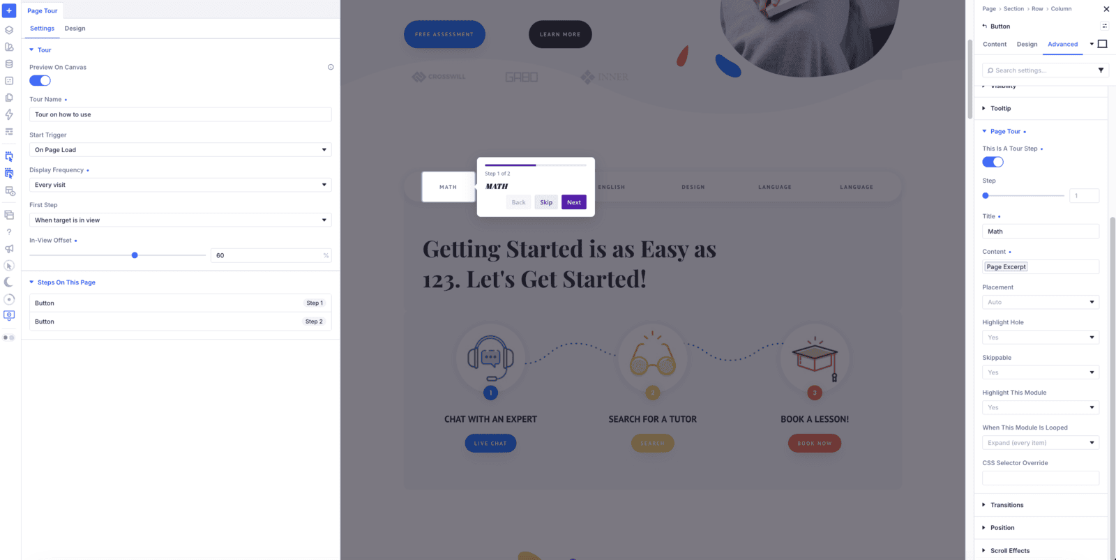
Open any section, row, column or module, go to Advanced → Page Tour, and switch on This is a tour step. A small Step label appears on that module on the Visual Builder canvas, so you can see your whole tour at a glance without opening anything.
Step sets the order: 1, 2, 3, and so on, up to 99. It is a plain number, not a measurement, so there are no units to fight with. Numbering is entirely yours. Nothing is renumbered behind your back when you add a step in the middle or loop a module.
Title and content, including dynamic text
Title is the heading in the popover and Content is the body copy, with a proper rich text editor so you can bold a word or drop in a link. Both support Dynamic Content, so a step can pull its text from the post, the product, or a custom field rather than being typed by hand.
That matters most inside a Divi Loop, where one designed step can produce a popover per item, each one titled with its own post title.
Placement, the highlight hole, and centred steps
Placement decides where the popover sits relative to the module: Auto, Bottom, Top, Left or Right. Auto is the sensible default, because it picks the side with room rather than the side you guessed at on a desktop screen.
Highlight Hole cuts an actual opening in the dim overlay so the module underneath stays visible and clickable. That is the difference between a tour that talks about a button and a tour where the visitor can press it while the step is still open.
Highlight this module can be turned off, which gives you a centred step that is not anchored to anything. That is how you write a welcome step at the start or a thank-you step at the end, without inventing a fake element for it to point at.
Skippable controls whether that particular step offers a Skip button, so you can let people out early on a long tour but keep them for the one step that really matters.
When a module is looped
If the module you have marked sits inside a Divi Loop, an extra option appears: When this module is looped.
Expand (every item) walks every item on the page in query order, so a grid of six products becomes six stops on the tour, each with its own hole and its own popover. First item only highlights just the first card and moves on, which is what you want when the loop is an example rather than the point.
Either way, the numbering of your other steps is untouched. A step you numbered 3 still plays after the loop run finishes.
CSS selector override
CSS selector override is the escape hatch. Leave it blank and the step highlights the module wrapper, which is right almost every time. Fill it in and the step highlights a child element inside that module instead, or an element in a Theme Builder header that is not part of the page layout you are editing.
The tour customiser: name, trigger, and frequency
Everything that belongs to the tour as a whole lives in the Page Tour customiser, opened from the Divi Builder bar.
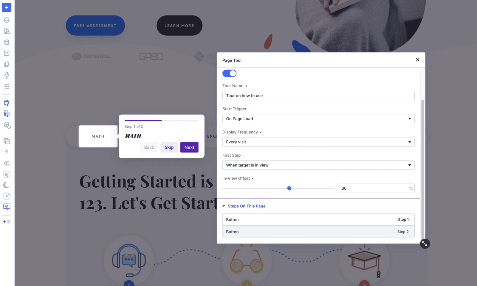
Tour Name is how the tour is remembered for a returning visitor. Start Trigger decides when it runs:
- On Page Load: the tour starts by itself when the page opens.
- On Click: the tour waits for a click on an element you name in Click Selector, which is how you build a permanent “Show me around” button.
- On Interaction: the tour starts once the visitor engages with the page rather than the instant it loads.
For page-load tours, Display Frequency keeps you on the right side of polite. Once per visitor shows it a single time. Every visit is useful while you are testing. Until skipped, the default, keeps the tour available until the visitor actively dismisses it, which respects the person who arrived, got distracted, and came back later.
Where the tour starts
First Step handles the awkward moment at the very beginning, when step one might be halfway down the page. Auto-scroll to target takes the visitor there. When target is in view waits until they have scrolled to it themselves, and In-view Offset sets how far into the viewport the element needs to be before the tour begins.
Steps on this page
The customiser also lists every step on the page in order, with its module name and a Loop tag where relevant. Click any row and the builder opens that module’s settings and scrolls to it. It is a small thing that makes editing a nine-step tour genuinely pleasant instead of a scavenger hunt.
Design: overlay, popover, progress, and buttons
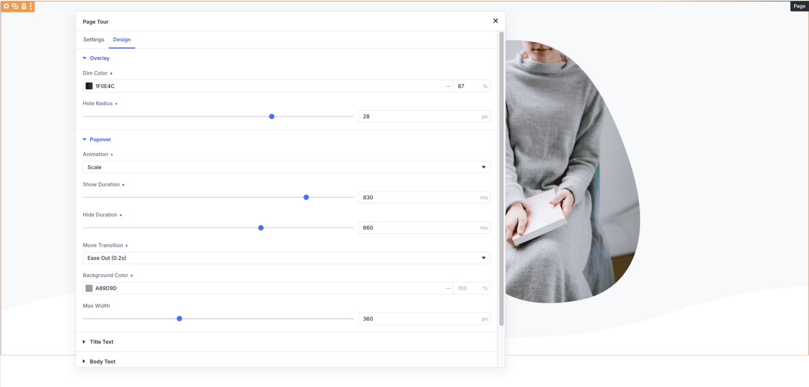
The Design tab styles the tour itself, and it is more thorough than you might expect:
- Overlay: Dim Color for the shade over the page, and Hole Radius so the spotlight can have rounded corners that match your cards.
- Popover: Animation (Fade, Scale, Shift Away, Shift Toward or Perspective), Show Duration and Hide Duration, a Move Transition for how it glides between steps, plus Background Color and Max Width.
- Popover text: separate typography for the title and the body, with font, weight, size, colour, line height, letter spacing, capitalisation and style.
- Progress: Bar Color and Track Color for the progress indicator.
- Buttons: a Primary tab for Next and Done, and a Secondary tab for Back and Skip. Each gets its own text colour and typography, background, border, box shadow, padding, and an optional icon with its own size.
The result is a tour that looks like it belongs to your site rather than a plugin that arrived and redecorated.
Preview on canvas
Preview on canvas runs the real overlay and the real popovers on the Visual Builder canvas while the customiser is open, so you can read your copy at its actual size and check the design without publishing and opening a private window.
It is strictly a builder tool. Visitors never see the toggle, and it is not saved with the page.
The thoughtful details
- Keyboard navigation: arrow keys move between steps and Escape closes the tour, so nobody is trapped in it.
- Reduced motion: the tour respects the visitor’s system setting and calms the animation down instead of ignoring it.
- It remembers: a visitor who finished or skipped the tour is not shown it again, according to the frequency you chose.
- Built for screen readers: the popover is announced as a dialog and the progress bar reports its position properly.
- Scroll and settle: the page scrolls to each target and waits for it to stop before the popover appears, so nothing lands on a moving element.
- Nothing loads until it is used: the tour scripts and styles are only queued on pages that actually contain an enabled step, so the rest of your site stays exactly as light as it was.
How to Enable It
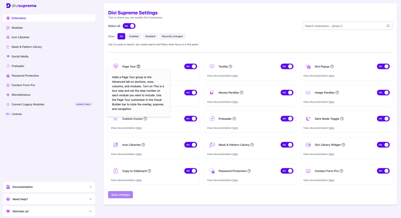
- In your WordPress dashboard, go to Divi Supreme → Extensions and switch on Page Tour. It is off by default, so nothing changes on your site until you turn it on.
- Open the page in the Visual Builder, click Page Tour on the builder bar, and set your tour name, trigger and design.
- Open the first module you want to explain, go to Advanced → Page Tour, switch on This is a tour step, set it to Step 1, and write the title and body.
- Repeat for each element you want to cover. The canvas labels show your running order as you go.
- Turn on Preview on canvas to walk the tour, then save.
Every setting is documented in full: Page Tour extension.
Why It’s Worth Using
Most of the confusion on a website is not a design failure. It is a sequencing problem. Everything is on the page, but nothing tells a first-time visitor what to look at first, and the person who built it is the one person who cannot see that.
A page tour fixes the sequencing without adding a single word of clutter to the design, because it only exists while the visitor wants it. You get fewer “where do I find” emails, better first sessions on the pages that matter, and clients who can use the site you handed them.
And because every step is just a setting on a module you already built, the tour stays correct as the page evolves. That is the part that usually breaks, and it is the part we set out to fix.
Ready to Try It?
Update to the latest Divi Supreme Pro, switch on Page Tour under Extensions, and give your visitors a guided first run through the pages you worked hardest on.
These are just a few of the many improvements. Your feedback is making Divi Supreme Pro for Divi 5 stronger every day. If you spot something, report it here!
Stay tuned for more updates, and please don’t hesitate to reach out if you have any questions or need assistance with anything related to Divi Supreme or Divi 5.
Best Regards,
Ken and the Divi Supreme Team
0 Comments